Why black cabinets are a gamble worth taking
Black is the one cabinet colour that can make a kitchen look custom and make it look gloomy – sometimes in the same room at different times of day. The deciding factors are rarely the cabinets themselves; they’re the light the room gets, the finish you choose, and how much black you commit to. Get those three right and black becomes the most forgiving ‘bold’ choice there is, because true black hides scuffs and the mismatched undertones a mid-grey would expose.
Used well, black reads as architectural and grounded rather than dark. The sections below are the three levers that decide which way it goes.
Match the finish to your light, not the showroom
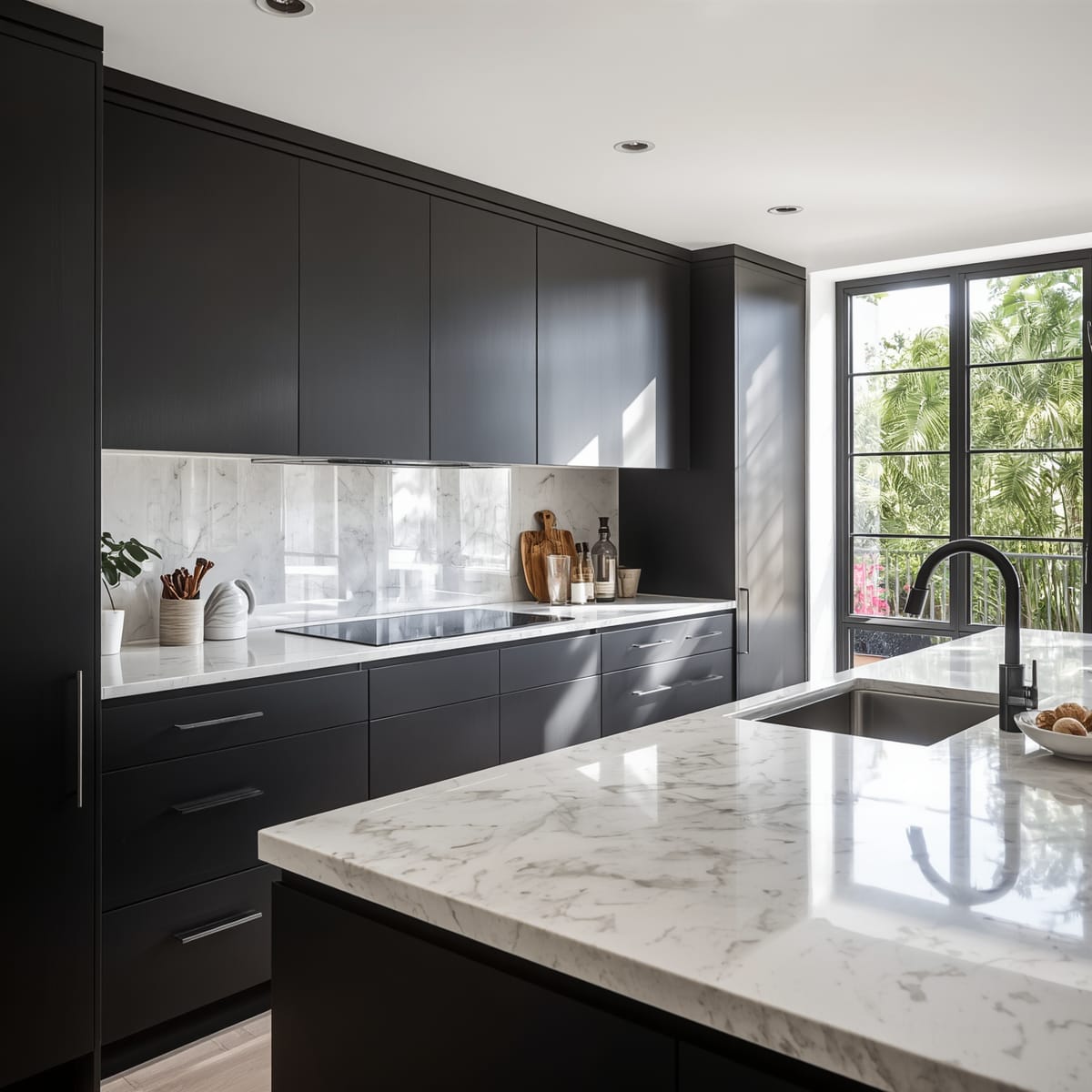
Matte and satin black absorb light and hide fingerprints, so they suit kitchens that already get good daylight – the room can afford to lose a little brightness. High-gloss black does the opposite: it bounces light, which can rescue a darker room, but it shows every fingerprint, water spot, and dust film, especially around handles and near the hob.
If you cook daily and dislike wiping doors, lean matte. If the kitchen is north-facing or short on windows, a gloss or a deep charcoal keeps it from closing in. This is the same daylight-first thinking that runs through our small kitchen design ideas: always design for the light you actually have.
Where to put the black (hint: usually not everywhere)
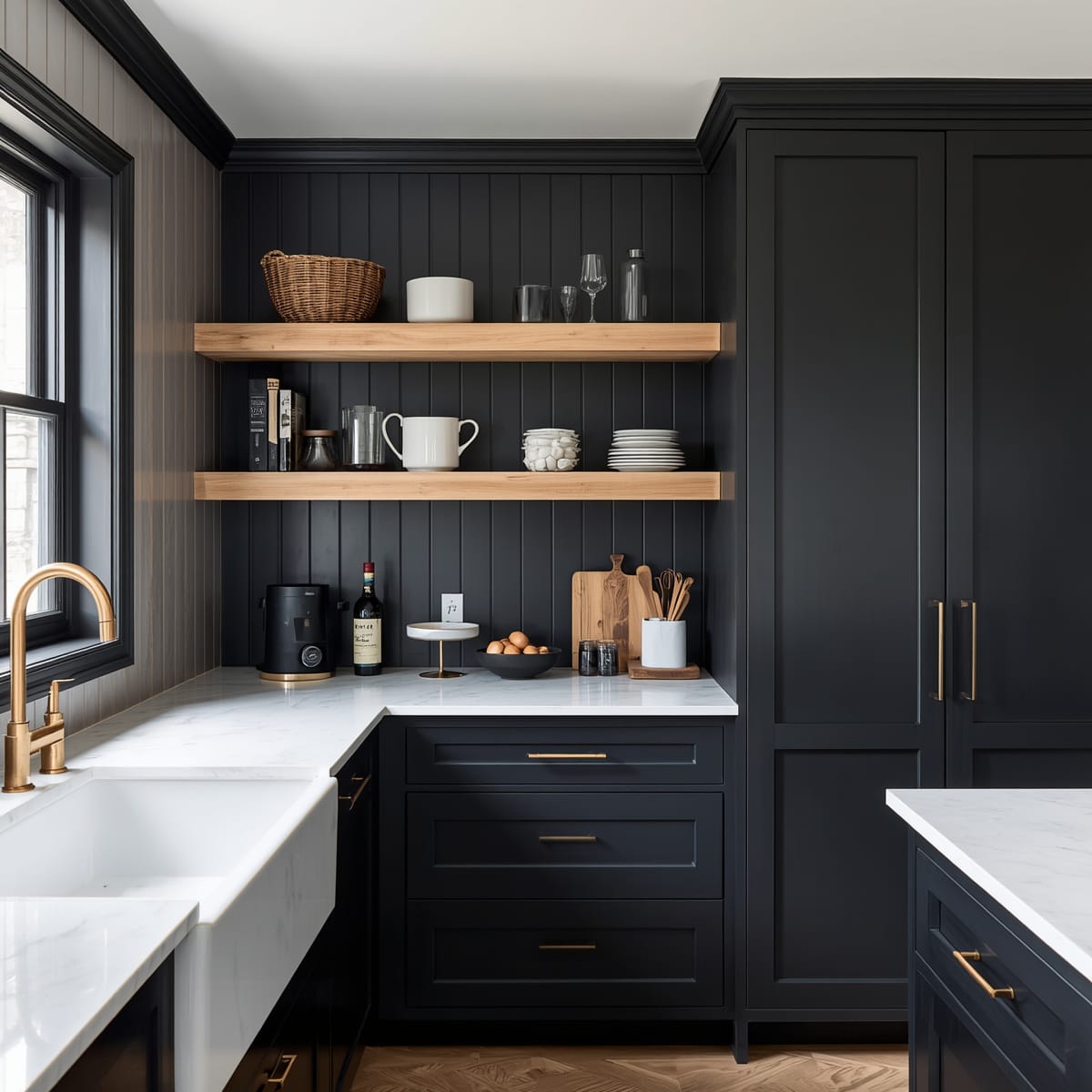
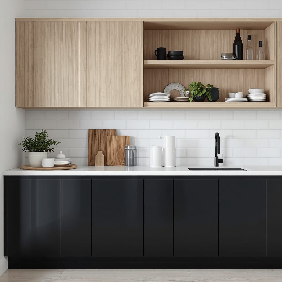
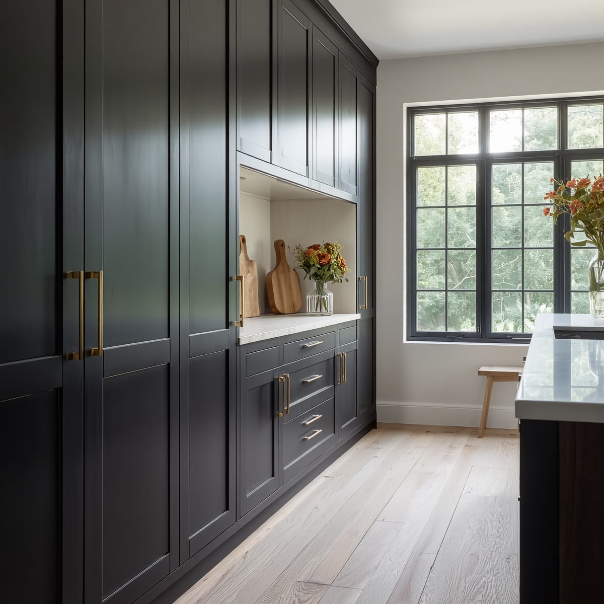
An all-black kitchen is a striking look but a small target – it needs space, good light, and discipline. The easier, more forgiving win is two-tone: black on the lower cabinets and island, with something lighter above. The dark base grounds the room visually while the upper half stays airy and the ceiling feels higher.
If you want openness up top instead of solid wall units, frosted glass cabinet fronts soften the contrast, and the handle-and-finish logic in our modern kitchen cabinet design ideas helps you choose hardware that flatters black.
Pair black so it reads warm, not severe
Black’s best friend is wood. White oak, walnut, or even a warm laminate on floating shelves, a worktop edge, or the flooring stops the room reading like a phone case. Warm metals – brass, aged bronze, brushed nickel – sit on matte black like jewellery, while chrome can look cold and clinical.
A pure black-and-white scheme is safe but can feel stark, so add a sliver of warmth: a wood shelf, a plant, a butcher’s block, or warm-white lighting. That small warm note is what turns ‘moody’ into ‘inviting’.
Choosing a worktop for black cabinets
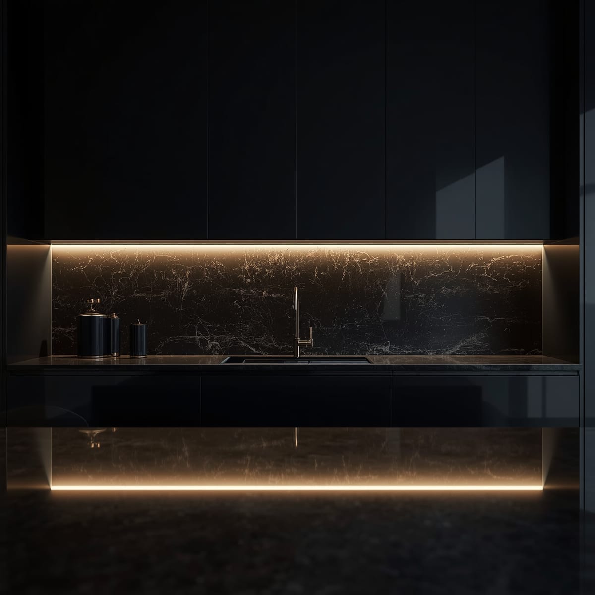
The worktop is the release valve. A pale worktop – white or grey-veined quartz, light marble, or pale composite – gives crisp contrast and keeps a black run from feeling heavy. Warm wood or a beige-veined stone softens the look further. Avoid pairing black cabinets with a black worktop unless the room is bright and you’re deliberately going for a dramatic, gallery-like effect, because the two can merge into one heavy mass.
Lighting a black kitchen
Black drinks light, so layering it matters even more than usual. Under-cabinet task lighting brightens the worktop and stops you working in shadow; a couple of warm-white sources prevent the flat, cave-like feeling a single cool overhead creates. Internal cabinet lighting behind glass fronts adds a soft glow at night.
Stick to warm-white bulbs (2700–3000K). Cool blue light makes black look grey and, worse, makes every fingerprint and smear glow.
The maintenance question everyone forgets to ask
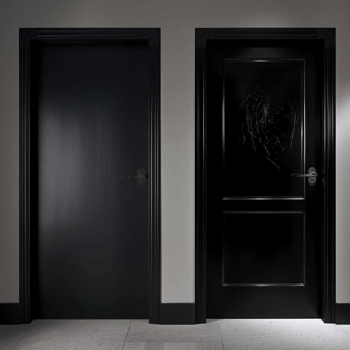
Black shows three things: fingerprints, dust, and dried water splashes. You reduce all three by choosing matte or a textured laminate over gloss, fitting handles so palms touch metal rather than the door, and using warm-white light rather than cool. A soft microfibre cloth and a quick wipe of the high-touch areas keeps it looking sharp, and the upkeep is far lighter than people fear – gloss is the only finish that genuinely demands daily attention.
Black beyond the kitchen
If you like the confidence of black but aren’t sure it belongs on your cabinets, the same balance-the-drama approach applies to bold colour elsewhere in the home. Our guide to red bedroom design ideas uses the identical principle – commit to the colour in one grounded place, then surround it with calm, warm neutrals so it reads intentional rather than overwhelming.