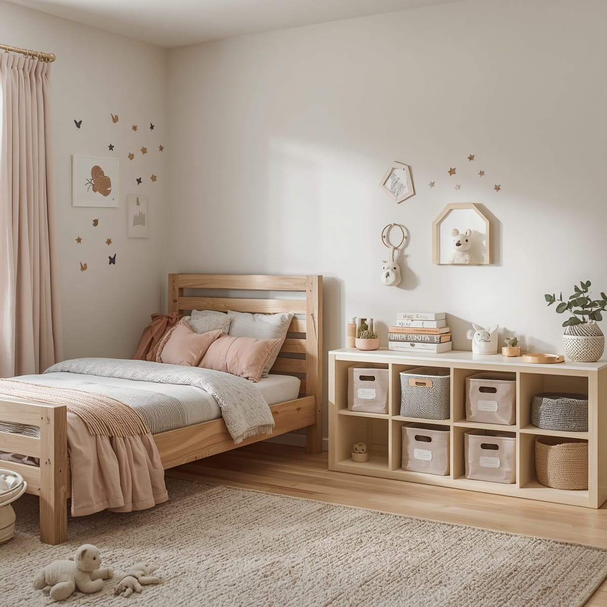
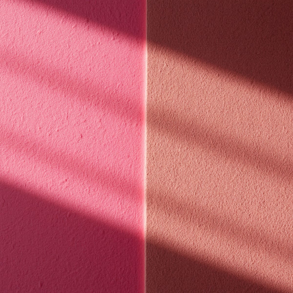
Pink lives or dies by its undertone
Most ‘too sweet’ pink bedrooms aren’t actually too pink – they’re too warm and too saturated. A clean candy pink reads young and playful; a pink with grey or brown mixed in – dusty rose, clay, mauve, blush – reads calm and adult. The undertone does almost all the work, so it’s the first thing to get right.
Pink also shifts more than almost any colour between daylight and warm lamplight, so always paint a large swatch, stick it on the wall, and check it morning and night under your actual bulbs before committing.
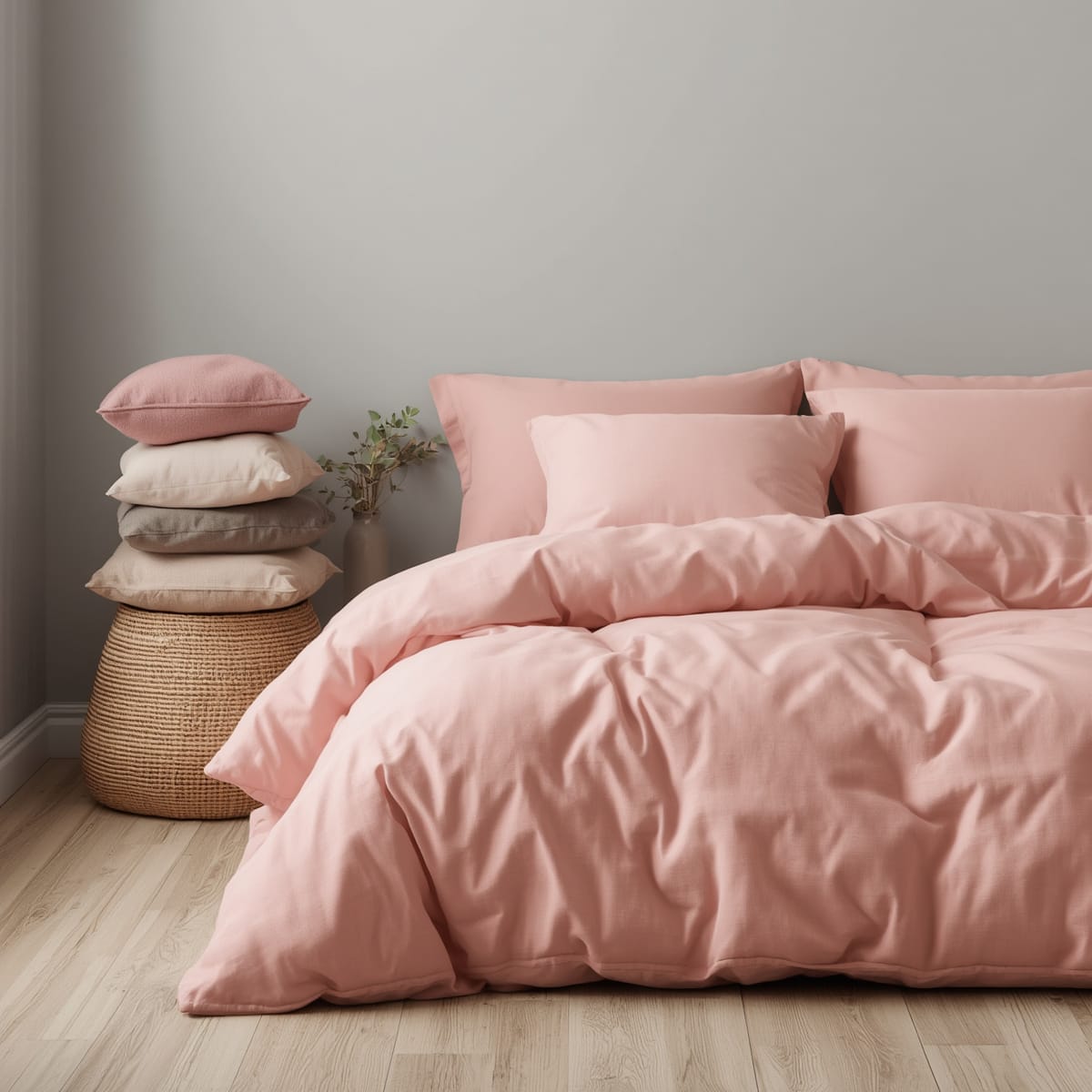
Use pink as the accent; let something darker anchor
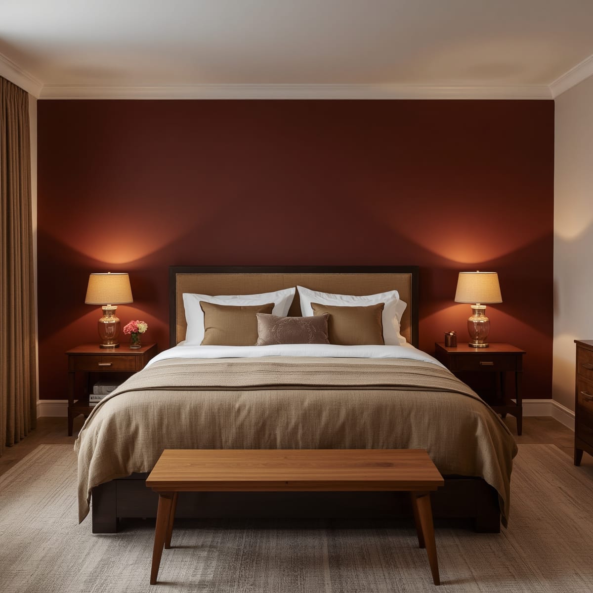
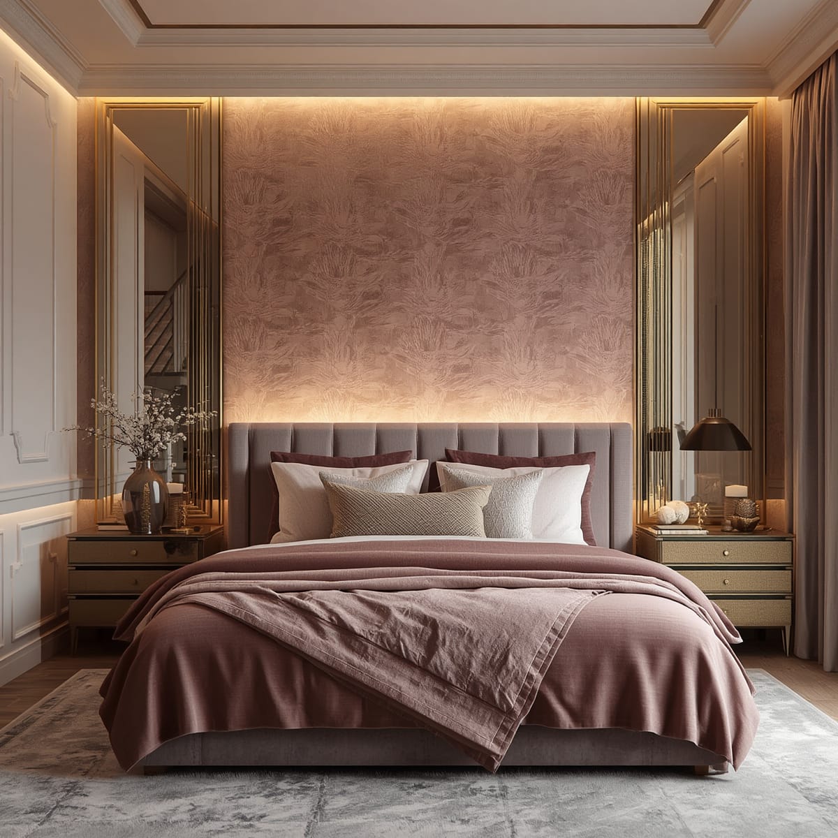
A whole-room pink can overwhelm. The reliable formula is a single dose of pink – a feature wall behind the headboard, the bedding, or the curtains – anchored by a heavier neutral such as charcoal, walnut, or forest green. The dark neutral gives the eye somewhere to rest and pulls the scheme toward ‘designed’ rather than ‘doll’s house’.
For the pieces that do the anchoring, our modern bedroom furniture sets in oak or charcoal sit naturally against blush, and wooden bedroom furniture adds the warmth that stops pink feeling flat.

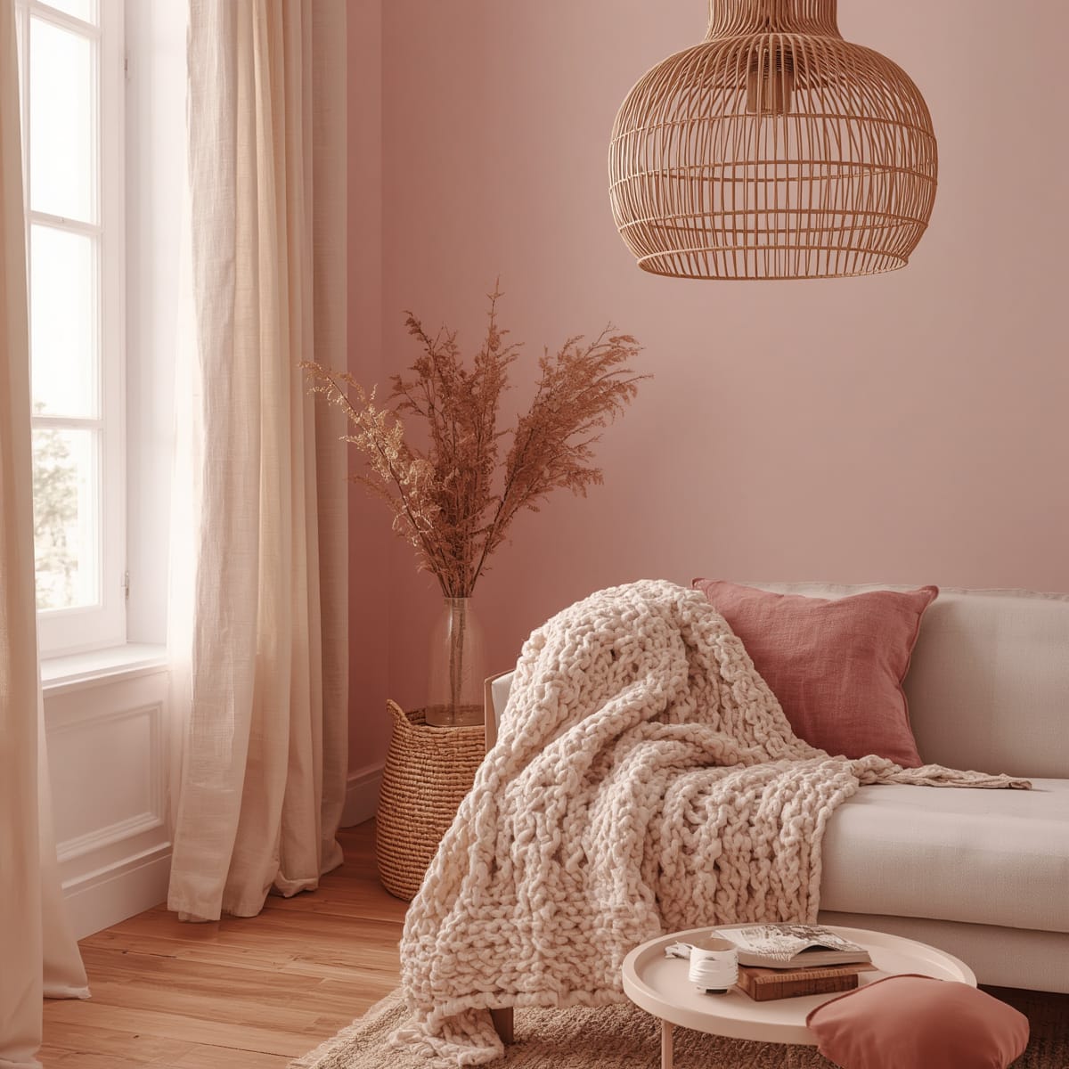
Pairings that keep pink sophisticated
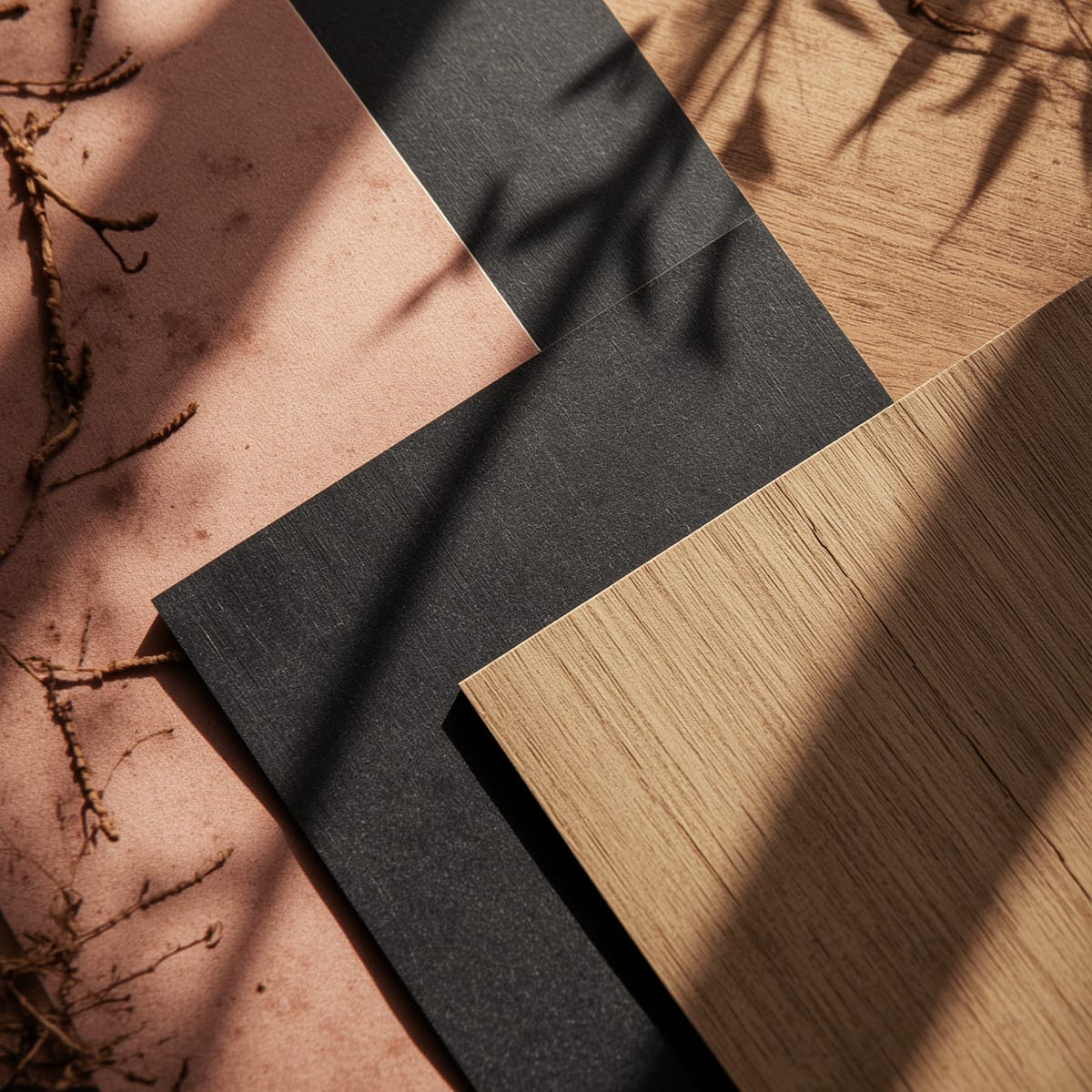
The most grown-up pink schemes lean on a tight palette. Charcoal and warm grey provide contrast; cream and oatmeal soften; oak and walnut warm; forest green adds richness; and a warm metal – brass or aged bronze – finishes it like jewellery. Avoid pairing a saturated pink with only bright white, which is the combination that tips a room toward juvenile.
Texture does more than extra colour
Once the palette is set, resist adding more colours and add texture instead. A linen duvet, a chunky knit throw, a velvet cushion, a rattan shade, and a wool rug give a restrained pink room depth without making it busy. Texture is the safer way to add interest to a calm scheme – more colour usually just makes it louder.
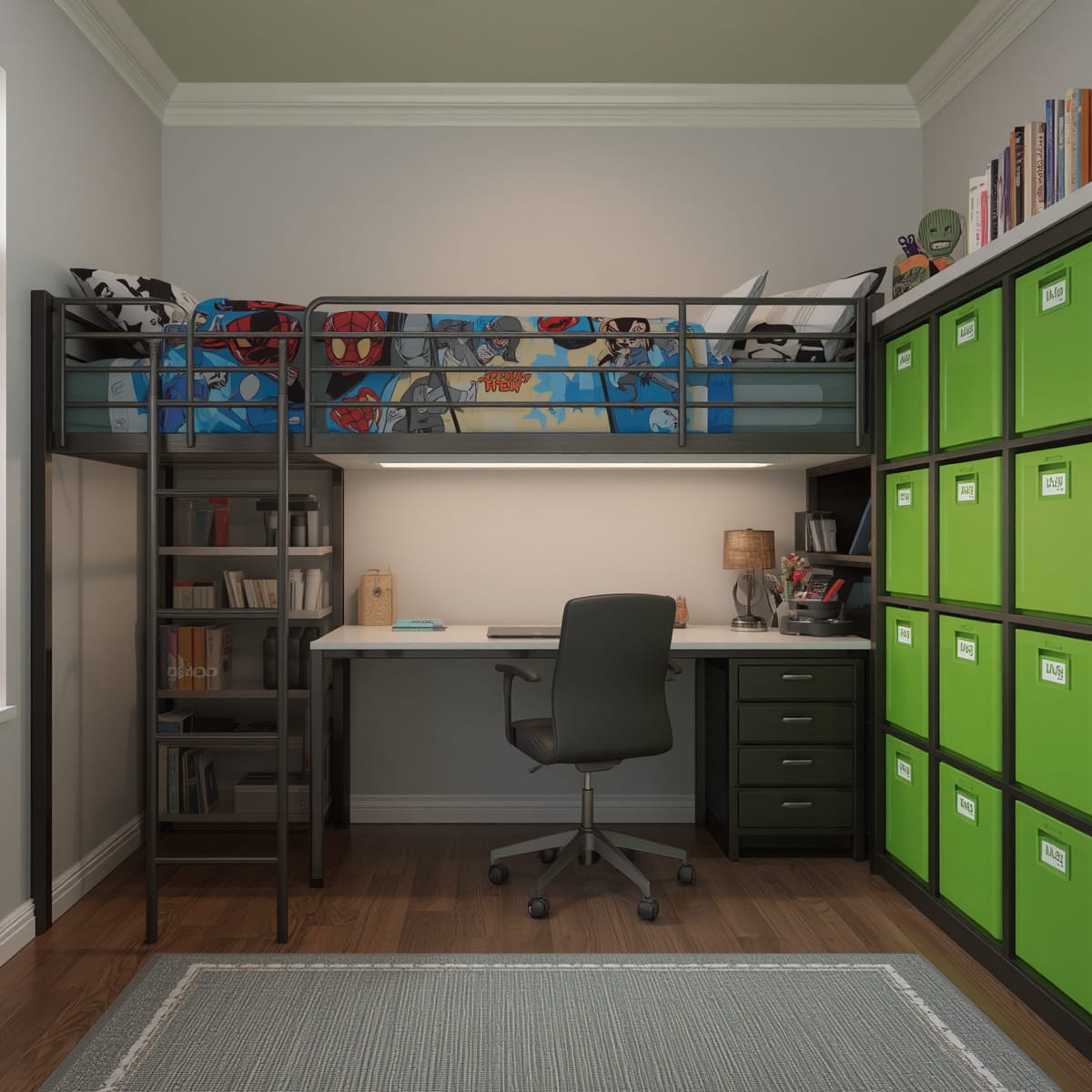
Pink for a child’s room vs an adult room
For a child’s room, the rules loosen on brightness but tighten on flexibility – choose a pink she won’t outgrow and apply it to things that are cheap to change, not to fixed furniture. We go deeper on that in our girls bedroom furniture ideas. For an adult room, treat pink like a sophisticated neutral and keep the saturation low. If you like warm tones but want more drama, compare the approach with our red bedroom design ideas.
Pattern instead of paint
A subtle pink-toned wallpaper can be softer than a solid painted wall, because the pattern breaks the colour into smaller pieces and stops it reading as a flat block. If that appeals, our 3D wallpaper for bedroom walls guide covers which textures read calm rather than loud behind a bed, so the colour stays restful.
Lighting and finish for a pink room
Warm-white lighting flatters pink; cool light can make a blush wall look chalky or grey. Layer bedside lamps with a soft overhead, and choose a matte or chalky paint finish for walls – high sheen exaggerates pink and shows imperfections. Test the chosen finish on the wall, not just from the tin, since sheen changes how the colour reads.
Common pink-bedroom mistakes
The usual missteps are choosing a warm, saturated pink and pairing it only with white, painting all four walls before testing the colour at night, layering pink accessories on top of pink walls on top of pink bedding, and using cool lighting that drains the warmth. Pick a muted undertone, use one dose, anchor with a darker neutral, and light it warmly.